
Designing a Celebration: Lyndon Whaite and SA's Jubilee 150 Logo

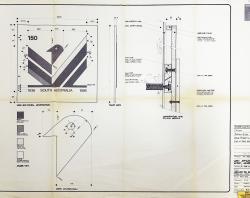
Layout plan of the 1836-1986 Jubilee 150 logo design.

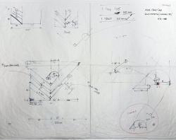
One of the initial drafts of the 1836-1986 Jubilee 150 logo design.

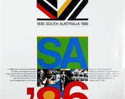
Poster for the 1836-1986 Jubilee 150 celebrations.


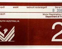
Vehicle registration sticker featuring the 150 Jubilee logo. Do you remember these stickers?
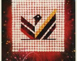
He incorporated two of the state's colours, red and gold, alongside black and white, so the logo sat firmly in South Australia’s visual heritage while feeling contemporary.
When 1986 arrived, the logo appeared everywhere. It was on posters announcing celebrations (including a poster titled The most exciting venue in 150 years), on brochures, on badges and plaques, and in the “Jubilee 150 Walkway” of bronze commemorative plaques along North Terrace, Adelaide.
For many people, the piping-shrike logo became the face of the celebrations, a clean, bold mark that said South Australia was looking both backwards at its founding and forwards to its future.
When all the festivals faded, the plaques remained. The Walkway still carries names of historical South Australian figures with the logo that symbolises the moment when that the state paused to reflect on its 150 years, dressed in design.
Explore more
Lyndon Whaite Graphic Design Pty. Ltd (SLSA: BRG 340)
Catalogue search results: South Australia Jubilee 150
‘The most exciting venue in 150 years : South Australia 150 in 1986’, poster. (SLSA: ZPL 0149)